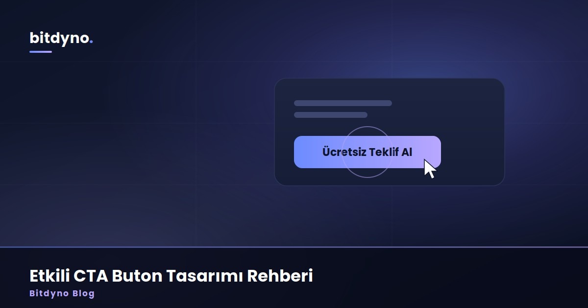
If visitors must guess the next step, most will leave. A strong CTA makes the action obvious.
What you should know
What is a CTA?
A call-to-action — the button or link that asks the user to do the next valuable thing: call, buy, submit, book.
How many buttons per page?
One primary action should dominate. Extra secondary links are fine; competing primaries confuse people.
What should the button say?
Use action verbs and outcomes (“Get a quote”) instead of vague labels (“Submit”).
Does color matter?
Contrast matters more than a magic color. The button must stand out from its surroundings.
How do I improve a weak CTA?
Clarify the offer, raise contrast, place it above the fold and after key proof, then test.
How Bitdyno approaches this
We start from the real business problem and usage scenario — not the trendiest tool. We compare options honestly, recommend only what solves the job, and put both build and long-term care costs on the table from day one.
One-line goal: invest in what your business actually needs.